Step 1: Prepare Your Data
Before creating a graph, it’s important to organize your data in Excel. Follow these steps to ensure your data is ready for graphing:
- Open Microsoft Excel and create a new workbook.
- Enter your data into separate columns or rows, with each column or row representing a different category or variable.
- For example, if you want to create a line graph to display monthly sales figures, list the months in one column and the corresponding sales data in another column.
Step 2: Select Your Data
Now that your data is organized, it’s time to select the specific data range you want to include in your graph. Follow these steps:
- Click and drag your mouse over the cells that contain the data you want to graph.
- Be sure to include both the category labels (e.g., months) and the corresponding data values in your selection.
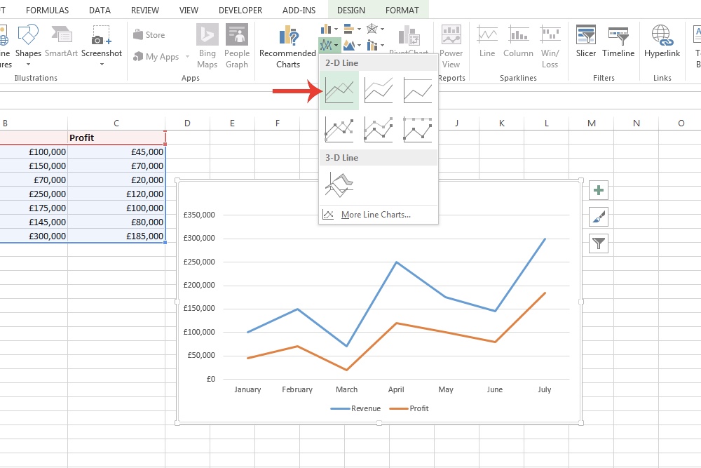
Step 3: Inserting the Graph
Once your data is selected, it’s time to create the graph. Follow these steps:
- Click on the “Insert” tab at the top of the Excel window.
- In the “Charts” section, you will find various types of graphs such as column, line, pie, bar, and more.
- Choose the type of graph that best represents your data. For example, select “Line” if you want to create a line graph.
- Click on the specific graph subtype you prefer. Excel will automatically generate a basic graph using your selected data.
Step 4: Customize Your Graph
After inserting the graph, you can customize its appearance to suit your needs. Follow these steps to make adjustments:
- Click on the graph to select it. This will display the “Chart Tools” menu at the top of the Excel window.
- Use the options available in the “Design” and “Format” tabs to modify the chart title, axes labels, data series colors, and other visual elements.
- Experiment with different styles and formats until you achieve the desired look for your graph.
Step 5: Updating and Modifying Your Graph
If you need to make changes to your graph or update the data, Excel makes it easy to do so. Follow these steps:
- Double-click on the graph to enter the editing mode.
- You can add or remove data series, change the data range, or modify any other graph elements.
- Excel will automatically update the graph based on your modifications.
Step 6: Saving and Sharing Your Graph
Once you’re satisfied with your graph, it’s important to save your Excel workbook. Follow these steps to save and share your graph:
- Click on the “File” tab at the top-left corner of the Excel window.
- Choose “Save As” and select a location on your computer to save the file.
- Give the file a descriptive name and choose the desired file format (e.g., .xlsx or .pdf).
- Click “Save” to save your workbook, including the graph.
Now you can easily share your Excel file containing the graph with others or use the graph in presentations or reports.
By following these step-by-step instructions, you can create professional-looking graphs in Excel to effectively visualize your data and gain valuable insights.
As an Amazon Associate we earn from qualifying purchases through some links in our articles.